Midjourney is a powerful tool for web design. The amazing times we live in today enable you to create a design for a site using only natural language.
It's important to note right at the beginning that the designs you make in Midjourney will have to be additionally worked on for them to be perfect for a website. Nevertheless, you can use AI generated site designs to come up with cool ideas and have a concept you can follow.
In case you plan on hiring a web designer for your business, you can also benefit from using Midjourney to make a site concept. You can forward the generated results to the designer to showcase how you want your website to look.
Last month, I wrote an article in which I explained how you can make logos with Midjourney. If you're using Midjourney to generate a website design, I also recommend reading the article about logos as you might find it quite helpful in this situation.
Midjourney Prompts for Website Design
It's quite easy to start writing good Midjourney prompts for website design. I advise using Midjourney v5 (or whatever the newest model is when you're reading this article) to generate these designs, as this iteration of the text-to-image model provides outstanding results.
One thing I must mention is that you're unable to edit text directly in Midjourney or instruct the model on what type of text to include in the image. This is a feature that will be available at some point in the future.
There are a few things to consider before you start writing prompts. For instance, you should have a clear idea of what type of website it will be. You might also want to clearly define which colors you want to see on the website, although it's not a requirement since Midjourney can sometimes give you amazing images when you let the colors be chosen randomly.
Another thing to consider before you begin writing prompts is whether there is a specific art style you want included in the website design. With all of that being said, let's see what type of designs you can make in Midjourney.
I'll start with a really simple prompt.
Midjourney Prompt for a Gym Website
/imagine website design for a state of the art gym, landing page, gym equipment, illustration of a strong man flexing, boxing gym, black and yellow colors --v 5 --ar 4:3
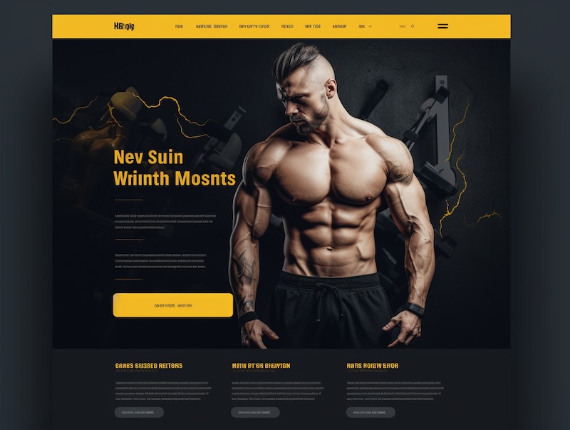
Here's one of the four designs Midjourney created for this prompt. I think these colors were excellent choices for a gym site design. Overall, the design looks very clean and I wouldn't mind sending this to a designer to improve it. Now, let's see what happens if I don't pick any specific colors.
Midjourney Prompt for a Herbs & Spices Store Website
/imagine website design, landing page, herbs and spices store, colorful, alluring, adventorous --v 5 --ar 4:3
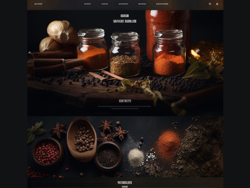
This is a nice landing page considering the very short prompt I wrote. I did expect it to be more colorful, but for some reason, Midjourney kept generating designs with darker colors. I think the design is quite eye-catching though and would be a good choice if I was really selling herbs and spices.
Midjourney Prompt for a Luxury Fashion Store Site
/imagine website design, small fashion store, high-end fashion, products page, gorgeous dresses, trending on Pinterest, beautiful suits, fabulous, stunning, luxury --v 5 --ar 4:3
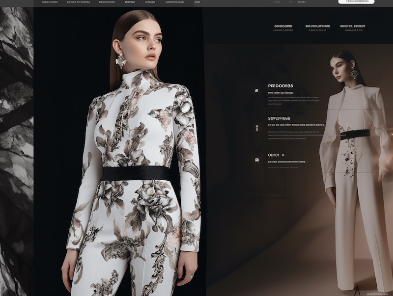
I'm not going to lie. Although this design concept is good, it would need a lot more work to be perfect. But it's a great starting point that you can build on or send to a professional web designer.
Midjourney Prompt for a Travel Blog Web Design
/imagine website design, travel blog, adventures, planes, hot air balloons, helicopters, inspiring, white and light blue colors, traveling around the world, voyage, exploring --v 5 --ar 3:2
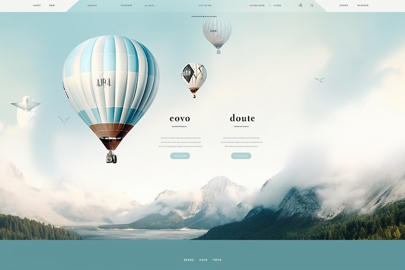
This is the type of website design I like the most. It's very clean and simple. You may have noticed that I changed the aspect ratio for this prompt.
Both the 4:3 and the 3:2 aspect ratios work great if you want to generate a website design for a PC/laptop experience. However, you can also create a design for a mobile app with Midjourney.
Midjourney Prompt for Social Media Mobile App
/imagine mobile website design, social media app similar to Pinterest, reactions button, like button, share button, photos, social media profiles, white and violet colors --v 5 --ar 2:3
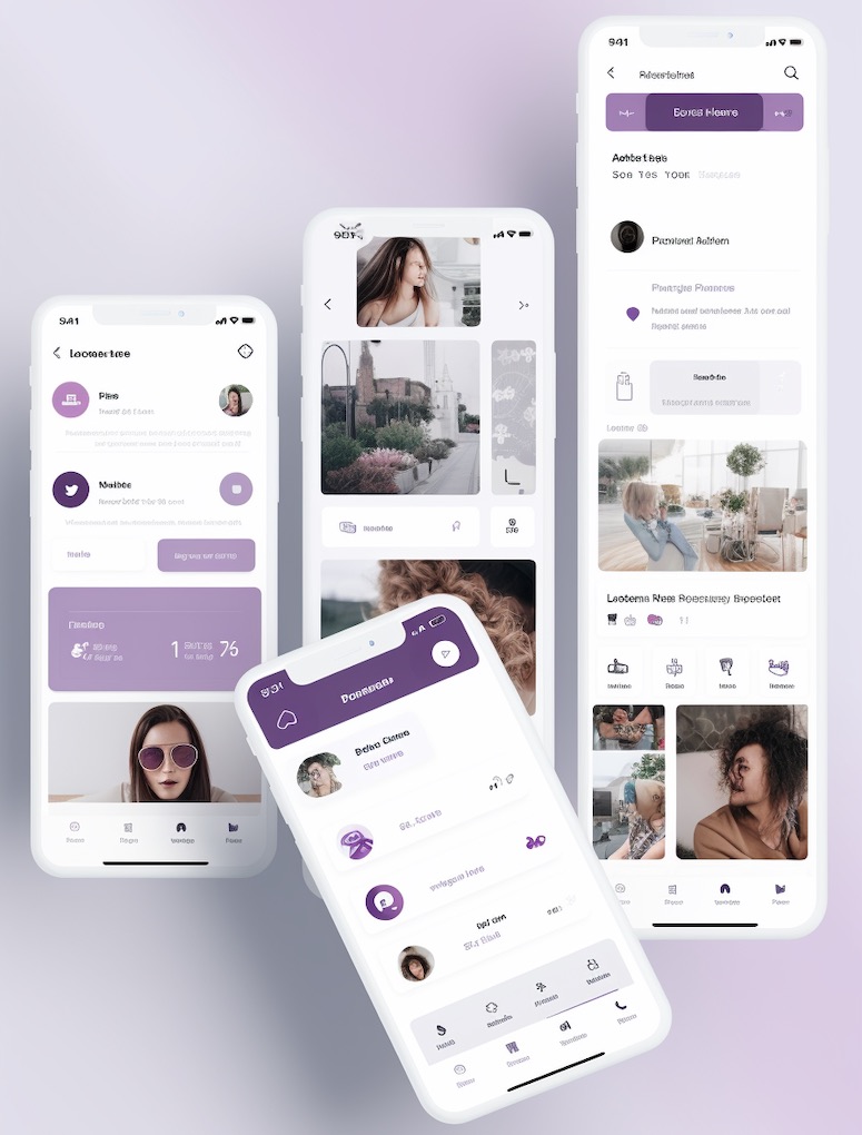
You don't have to say it. I know these phones look weird, and I truly hope no company ever makes a smartphone like the one on the right because it's too long. Midjourney might not be good at figuring out the right dimensions of a smartphone, but it can generate a great design for a smartphone app. Let's try one more app design.
Midjourney Prompt for a Writing Mobile App Design
/imagine mobile app design, clean UI, simple, bright orange and black colors, app for writing and sharing articles, app for writers, social media network for writers --v 5 --ar 2:3
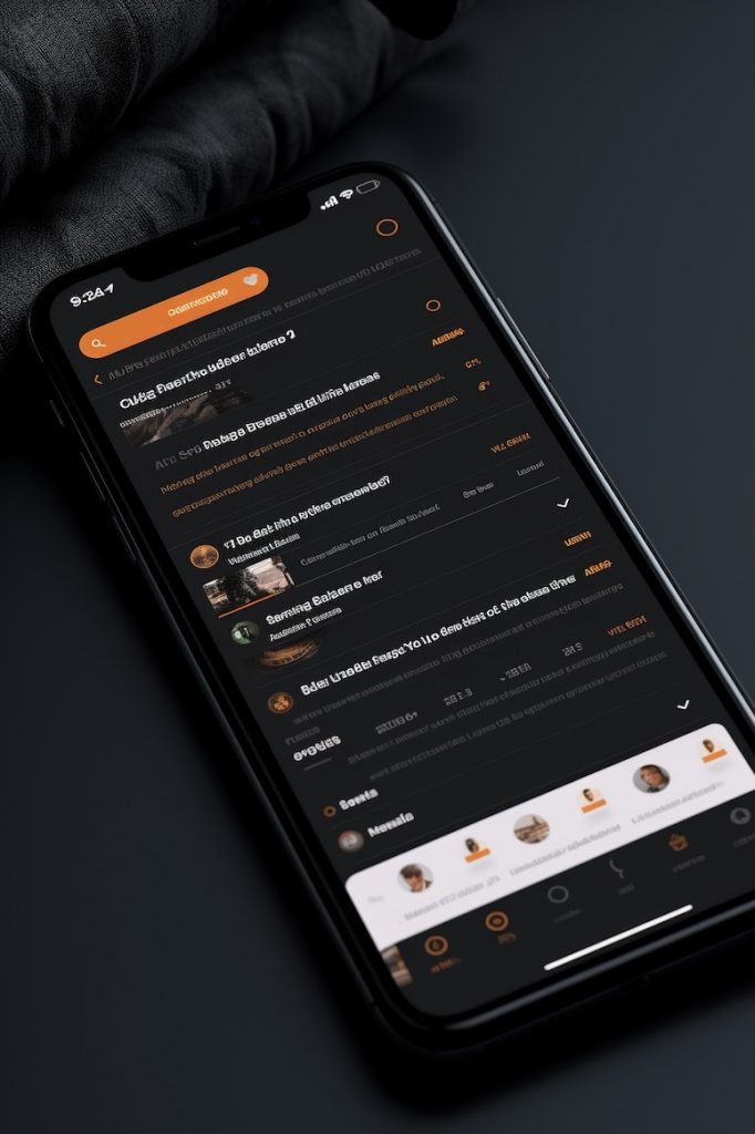
Quite a clean and simple UI, which is exactly what I wanted to see. Quick note - when you want to generate a mobile app design in Midjourney, you should be careful which aspect ratio you use. In my opinion, you get the best results when you use a 2:3 or 3:4 aspect ratio.
Midjourney Prompt for a RPG Video Game Website
/imagine modern website design, fantasy RPG video game, high fantasy, red and dark blue colors, fight between good and evil, freedom, wonder --v 5 --stylize 500 --ar 3:2
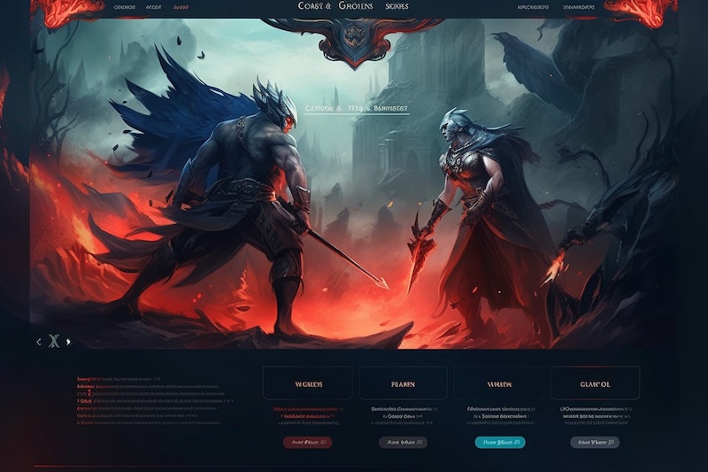
The stylize parameter in Midjourney is used when you want the result to be more artistic. However, the higher the stylization value is the less connected the image will be to the prompt. This parameter's default value is 100, but it can be any integer between 0 and 1000. I input a value of 500, which is objectively a high stylization value.
You can see what type of positive effect the stylize parameter can have on website design in Midjourney. I first wanted to show you several examples of designs without a high stylization value for you to understand and see how important it can be to use parameters like these in your prompts.
Midjourney Prompt for an IT Store Website
/imagine cyberpunk style website design, website for a modern IT store, black, yellow, and green colors, experimental design, futuristic, clean, landing page --v 5 --stylize 750 --ar 4:3
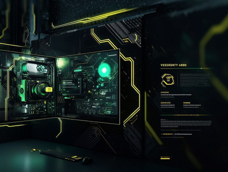
This is very interesting, to say the least. I like how creative this design is compared to most of the others in this article, but that probably has a lot to do with setting the stylization value at 750. All in all, I'm quite impressed with the result here.
Midjourney Prompt for a Freelance Website With Flat Design
/imagine freelance website design, minimalism, flat design, simple, vector art, Fiverr, Upwork, white and light green colors, easy to navigate, responsive --v 5 --ar 3:2
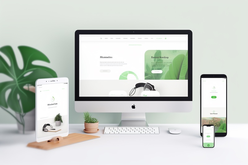
I included Fiverr and Upwork as references that the model can use for inspiration. This design stood out to me and I especially like how it allows you to see what it would look like on multiple devices. The crazy thing is that the design is consistent on each device, which just blows my mind. I can't believe how good text-to-image AI currently is.
Midjourney Prompt for Cake Shop Website
/imagine website design, cake shop, order online, retro art style, elegant, beautiful cakes on display, fancy --v 5 --ar 3:2
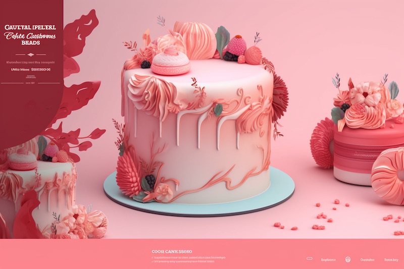
I think it's safe to say at this point that you can use Midjourney to generate a good website design concept regardless of the type of business you're making the site for. I really like the colors that were chosen at random here, they're a good fit for a cake shop website.
That's about it as far as Midjourney prompts for web design go. I shared 10 ideas you can try out to generate a website design in Midjourney. I recommend that you get creative and experiment with different ideas to see what you can create.
Final Thoughts
Using natural language to create a website design in less than a minute would've sounded like something from a sci-fi novel only a few years ago. Yet people all across the globe now have this ability with Midjourney.
Today, I shared 10 Midjourney prompts for web design that I hope you'll find helpful. To summarize, here are a few things you should pay attention to when generating web design in Midjourney:
- Think of an art style you can include in your prompt.
- Figure out whether you should use the stylize parameter.
- Determine if you should use any other parameters.
- Decide whether you should specify which colors should be used in the design.
- Use keywords to describe how you want the website to look.
Those are the five most helpful tips I can give you when it comes to designing your website in Midjourney. I hope you have a lot of fun experimenting with this text-to-image model and use a generated design for inspiration when you're making your next website.